TL;DR:
- Understanding colour theory helps create cohesive and visually appealing surfwear outfits.
- Starting with neutral core pieces allows easy mixing and matching with bolder items.
- Testing outfits in natural sunlight prevents clashing colours and ensures harmony at the beach.
Choosing surfwear that actually looks good together is harder than it sounds. You grab a bright rashie, throw on some boardshorts, and suddenly the whole outfit feels like a traffic accident. It happens to every surfer. The good news is that colour matching is a learnable skill, and once you understand a few core principles, building a sharp, cohesive beach look becomes second nature. This guide walks you through everything: from colour theory basics and essential wardrobe building blocks to step-by-step outfit planning and troubleshooting the most common missteps.
Key Takeaways
| Point | Details |
|---|---|
| Start with style basics | Understanding colour theory and common palettes makes choosing surfwear outfits easier. |
| Build on essentials | Choose versatile surfwear items and layer colours for easy matching. |
| Use step-by-step rules | Follow a process—base, compliments, accessories, sunlight check—to achieve a consistent style. |
| Troubleshoot your look | Check for clashing shades and refine for a comfortable, confident feel. |
Understanding surfwear colours and style basics
Before you can match surfwear confidently, you need a rough grasp of how colours interact. You don't need to be an artist. You just need to know a few rules that designers use every day.
Colour theory breaks colours into primary (red, blue, yellow), secondary (orange, green, purple), and complementary pairs. Complementary colours sit opposite each other on the colour wheel, like blue and orange or red and green. When used intentionally, they create bold, high-energy contrast. Analogous colours sit side by side on the wheel, such as aqua, teal, and blue, and these create harmonious, relaxed combinations that work brilliantly for beach settings.
Surfwear colour palettes tend to cluster into three main categories. Bold neons like electric pink, lime green, and fluorescent yellow scream energy and visibility. Pastels such as soft coral, dusty blue, and mint feel laid-back and effortlessly cool. Tropical prints mix several hues at once, usually pulling from warm reds, oranges, and greens inspired by the ocean environment. Staying across surfwear colour trends helps you understand what palettes are popular each season, which makes shopping a lot easier.
Here is a quick comparison to help you understand when to match versus when to contrast:
| Style approach | Best for | Example combo |
|---|---|---|
| Matching (tonal) | Polished, coordinated look | Navy rashie + navy boardshorts |
| Complementary contrast | Bold, standout presence | Coral rashie + turquoise shorts |
| Analogous harmony | Relaxed, natural vibe | Sky blue top + aqua shorts |
| Neutral base + pop | Versatile, easy to build on | White rashie + bright print shorts |
Key do's and don'ts worth knowing:
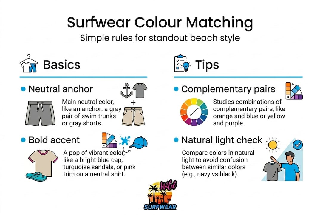
- Do use a maximum of three colours per outfit
- Do let one colour dominate and let the others support
- Don't mix two clashing prints without a neutral to anchor them
- Don't assume matching means identical. Tonal variation within one colour family looks intentional and polished
Reading up on ocean-inspired fashion tips is a great way to see how the natural beach environment can guide your palette choices in a really organic way.
What you need: Building blocks for matching surfwear
Great colour matching starts before you even think about combinations. It starts with having the right wardrobe pieces to work with.
The core building blocks of a surfwear outfit include:
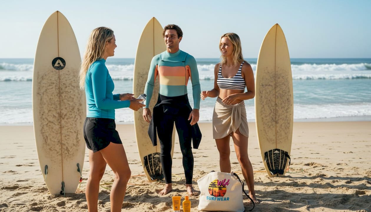
- Rashguards (rashies): The anchor of most surfer outfits. Available in long and short sleeve, they set the tone for the whole look
- Boardshorts or swim trunks: Usually the loudest piece in terms of pattern and colour
- Swim shirts: Lightweight and UV-protective, great as a middle layer
- Hats and caps: Bucket hats or surf caps add a finishing touch and offer SPF coverage
- Accessories: Sunglasses, surf stickers, and wristbands can tie the colour story together
Material matters too. Quick-dry fabrics and UPF 50+ rated textiles are the standard for serious surfers and beachgoers. Darker colours tend to offer slightly more UV resistance, while lighter fabrics dry faster in hot Australian sun. These practical factors should always sit alongside your style decisions.
The smartest way to build a mix-and-match wardrobe is to start with a neutral or staple piece. A black, white, or navy rashie is essentially a blank canvas. It pairs with almost any boardshort pattern or colour. From there, you can layer in bolder pieces without worrying about clashing. Understanding the surfwear building blocks needed for a functional wardrobe gives you confidence when shopping and stops you wasting money on pieces that don't work together.
| Surfwear item | Colour tip | Primary purpose |
|---|---|---|
| Rashguard | Choose neutral or bold as anchor | Sun protection, core style piece |
| Boardshorts | Use prints to introduce colour | Comfort, freedom of movement |
| Swim shirt | Stick to solid tones | UV protection, versatility |
| Bucket hat | Match to dominant outfit colour | Sun protection, style accent |
| Sunglasses | Frame colour to complement base | Eye protection, finishing touch |
Pro Tip: Buy at least two neutral rashies before experimenting with bold or patterned pieces. Neutrals are your insurance policy against a wardrobe full of items that don't work together.
Step-by-step guide to matching surfwear colours
Now that you've got your building blocks sorted, here's exactly how to put a colour-matched outfit together from scratch.
-
Pick your base piece. This is usually your rashguard or boardshorts, whichever is the stronger visual. If you're wearing a bold tropical print boardshort, let that be the base and build around it. If your shorts are plain, the rashie can do the heavy lifting.
-
Identify the dominant colour in your base piece. Look for the colour that takes up the most space or catches the eye first. For a floral print short, it might be a warm coral. For a block-colour rashie, it's obvious.
-
Choose your second piece using complementary or analogous logic. A coral dominant print pairs brilliantly with a white or cream rashie (neutral), or you could go bold with an aqua top for complementary contrast. Avoid picking a second print unless the colours within both prints share at least one colour in common.
-
Add accessories as colour accents, not main events. A bucket hat in a neutral or a single accent colour from your outfit ties everything together. Going overboard with accessories in different colours creates noise, not style. Check out ideas for coordinating surfwear for style and think about how your accessories fit the overall story.
-
Check the full outfit in natural light before you head out. Indoor lighting flattens colour and changes how hues read. Stand outside in the sun for a moment. Sometimes a combo that looked perfect inside feels off at the beach.
Always test your outfit in direct sunlight before committing. Artificial light changes colour perception significantly, and what looks coordinated inside can clash badly once you're standing on the sand.
Pro Tip: If you're unsure whether two colours work together, photograph the outfit in sunlight and look at the photo. Your eye reads colour more critically in a flat image than it does in the mirror.
For surfers who want to express individual personality through their kit, personalising your surf outfit offers smart ways to add character without disrupting your colour flow. And if you're after maximum visibility in the water, neon rashguards are worth exploring as a bold base piece choice.
Troubleshooting and perfecting your surfwear look
Even with solid preparation, colour combinations sometimes don't land the way you hoped. Here's how to spot and fix the most common problems.
Common colour matching mistakes and easy fixes:
| Mistake | Why it happens | Easy fix |
|---|---|---|
| Two clashing brights | Both pieces compete for attention | Swap one bright for a neutral |
| Too many patterns | Print overload creates visual chaos | Keep one print, make the rest solid |
| Washed-out combos | Pastels can disappear in bright sun | Add one deeper or richer accent colour |
| Mismatched undertones | Warm and cool tones clashing | Stick to either warm or cool tones across the outfit |
| Over-accessorised | Too many colour additions | Limit accessories to one or two pieces max |
Quick checklist before you leave the house:
- No more than three colours in the full outfit
- One piece is clearly dominant
- Accessories share at least one colour with the main outfit
- You've checked the combo in natural light
- The outfit suits the activity (surf session versus beach hangout)
Seasonal updates are also worth thinking about. In summer, bright neons and tropical prints feel right at home. In cooler months or during early morning surfs, richer tones like deep ocean blue, forest green, and burgundy create a moodier, more considered look. Understanding how surfwear and beach culture evolve across seasons keeps your style feeling fresh rather than dated.
Don't be afraid to experiment. Style develops through trial and error, and even a misfire teaches you something useful about your personal preferences.
Why matching surfwear colours is about more than looks
Here's something most style guides won't tell you: getting your colours right isn't just vanity. There's a practical dimension that surfers genuinely benefit from. Bright, well-chosen colours increase your visibility in the water, making it easier for other surfers, lifeguards, and beach-goers to spot you quickly. That matters in a crowded break or challenging surf conditions.
Beyond safety, colour choices signal belonging and identity. Surfing has always had a visual culture, and as explored in the surfwear fashion history, the way surfers dress has reflected community values, era, and attitude for decades. When your outfit is intentional and cohesive, it communicates that you take your craft seriously. It also just feels good. Confidence on land carries into the water, and looking sharp before you paddle out is one of the easiest ways to get your head in the right space.
Find your perfect colour match with Wild Surfwear
Knowing the theory is one thing. Having access to a range of pieces that actually work together is another.
At Wild Surfwear, we design our collections with colour coordination in mind, so you can mix and match across styles without second-guessing yourself. Browse our Wild Rashguards collection for bold, ocean-inspired pieces that anchor any outfit. If you want to stand out in the water and on the sand, our ProVis Rashguards deliver high-visibility neon colourways with full UV protection. Explore the range and start building a wardrobe that works as hard as you do.
Frequently asked questions
What colours are best for matching surfwear?
Neutral colours like black, white, and navy are the easiest starting point, while bold neons and pastel combinations create standout looks when paired with intention.
How do I avoid surfwear colour clashes?
Stick to complementary or analogous colour pairings and always check your full outfit in natural outdoor light before heading to the beach.
Does the sun affect how surfwear colours look?
Yes, bright sunlight makes colours appear more vivid or more washed out depending on the shade, which is why testing your combo outdoors before you commit is essential.
Are matching accessories important for surfwear?
Coordinating accessories like hats and sunglasses finish the look nicely, but keeping the overall palette to three colours maximum prevents the outfit from feeling overcrowded.